
Studio Roses – Neue Montreal by Pangram Pangram
We asked the creative community about the fonts they’re keen to get their hands on. Read on to find out how they responded.
Don’t you just love how typography is constantly evolving? Because let’s be clear: foundries around the world are pushing the boundaries of the discipline every day of the week. And that doesn’t just mean crafting brand-new typefaces, but also breathing new life into timeless classics.
There’s just one problem: with all the incredible font releases out there, it’s easy for some to slip under the radar. Which is exactly why we reached out to the Creative Boom community to find out which fonts they’re buzzing about for 2026. Wisdom of crowds and all that.
You’ll find the results below: 50 popular typefaces that graphic designers look likely to make strong use of in the year to come. It’s a heady fusion of retro vibes and modern functionality, from elegant serifs being reimagined for the digital age to bold, expressive sans-serifs ready to make a serious splash in branding and editorial design.
In short, whether you’re looking to refresh your go-to collection or searching for new type to bring your latest project to life, you’re sure to find some exciting new options. Enjoy!
1. GT America by Grilli Type
GT America aims to bridge 19th-century American Gothics with 20th century European Neo-Grotesk traditions, and take the finest design features from both. In practice, it proves remarkably versatile, and works well across both corporate identity systems and editorial applications. Designed by Noël Leu with Seb McLauchlan, this comprehensive family offers 84 styles, with extensive script extensions developed alongside Tania Chacana.

Sight Lines: Women in Art in Aotearoa by Studio Katie Kerr GT America by Grilli Type


2. Söhne by Klim Type Foundry
Kris Sowersby’s Söhne captures the memory of Akzidenz-Grotesk, filtered through Helvetica’s influence, and specifically evokes the analogue feel of Standard Medium as used in New York’s subway signage. But rather than being a direct revival, Sowersby has created something more nuanced: a typeface that channels the confident boldness of those classic grotesques, while feeling utterly contemporary at the same time. Built from the semibold weight outward, it includes condensed, wide and monospaced variants.

Söhne by Klim Type Foundry
3. Graphik by Commercial Type
An “emphatically vanilla” editorial workhorse, Graphik has become one of Commercial Type’s most popular releases. This hybrid typeface combines geometric sans-serif roundness with European grotesk architecture and proportions, while avoiding the baggage of more dogmatic modernist alternatives. Its low contrast, open counters and compact descenders make it a good choice for tight editorial settings, whilst human touches such as round dots mean it also works well for display.
4. Aeonik by CoType Foundry
Mark Bloom and Joe Leadbeater’s Aeonik presents itself as a neo-grotesque with geometric foundations, achieving mechanical precision through strict perpendicular terminals, whilst maintaining warmth through its rounded letterforms. Its eight weights, from Air to Black, are enhanced by variable font technology and since launching in 2021, it’s become a favourite for global brands including Revolut, Eurosport, Alipay and Virgin Hyperloop.

Aeonik by CoType Foundry

Aeonik by CoType Foundry
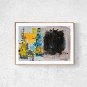
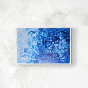
5. Neue Montreal by Pangram Pangram
Mat Desjardins created Neue Montreal in 2018 as a versatile grotesque with the spirit of a display font. Inspired by the Canadian city that became a beacon of modernist design in the 1960s and 1970s—a place where graphic design wasn’t just a profession, but a cultural force—this timeless sans-serif has been the official typeface of football club Montreal FC since 2021. It’s available in 14 weights.

Joan Creative – Neue Montreal by Pangram Pangram


6. Basis Grotesque by Colophon Foundry
Originally developed for photography magazine Hotshoe in 2012, Basis Grotesque drew inspiration from Akzidenz and early Monotype grotesques. But it’s since been refined towards something more considered and shapely. The family’s skeletal consistency across weights creates a sense of unity, whilst allowing each style to develop its own personality, from Light through to Black.
7. Maison Neue by Milieu Grotesque
Maison Neue is a complete reconstruction of the original Maison family, moving beyond the latter’s rigid geometric construction towards greater optical refinement. This superfamily of 40 styles includes the original, subtly condensed version, an extended counterpart, and mono-spaced alignment, each with additional weights.
8. Favorit by ABC Dinamo
ABC Favorit is a straightforward yet characterful grotesque that combines geometric rigidity with subtle oddities and humorous touches. Designed by Johannes Breyer and Fabian Harb, it’s available in five weights with italics, along with extended and expanded variants. Smart underlines create unconventional letter shapes, whilst script extensions cover Greek, Cyrillic, Hangul and Arabic.

Favorit by Dinamo Typefaces GmbH

Favorit by Dinamo Typefaces GmbH
9. Sharp Grotesk by Sharp Type
Appearing in three versions since its birth in 2016, Lucas Sharp’s Sharp Grotesk Global has evolved from hand-drawn poster lettering into Sharp Type’s most comprehensive superfamily. Featuring 12 weights and seven widths across Roman and Italic styles, with extensions in Greek, Cyrillic, Hangul and Thai, this font balances modernist rigour with hand-drawn imperfection.
10. Diatype by ABC Dinamo
With a name that references the pre-digital typesetting machines that influenced its design, Diatype is a warm yet sharp grotesque that’s optimised for screen reading. Created by Johannes Breyer and Fabian Harb, this font captures the essence of Swiss Neo-grotesque tradition whilst addressing the needs of contemporary digital type. Its careful balance between warmth and precision makes it particularly effective for extended reading applications, across various digital platforms.

Diatype by Dinamo Typefaces GmbH

Diatype by Dinamo Typefaces GmbH
11. Founders Grotesk by Klim Type Foundry
Initiated by Duncan Forbes and developed by Kris Sowersby, Founders Grotesk is less of a strict historical revival and more a thoughtful amalgamation of early 20th century grotesque traditions. Drawing primarily from Millar & Richard’s Grotesque series and H.W. Caslon’s Doric, its design captures appealing historical quirks whilst discarding outdated awkwardness. The family has recently expanded to include Text, Condensed, X-Condensed and Mono versions. Each of these is optimised for specific applications, from punchy headlines to robust body copy.
12. Aperçu by Colophon Foundry
Aperçu originally emerged from Colophon Foundry’s ambition to create a contemporary synthesis of classic realist typefaces, including Johnston, Gill Sans, Neuzeit and Franklin Gothic. Since its 2010 release, this 16-style family has been adopted by MoMA, Burberry and the Walker Art Center. Its success highlights how thoughtful amalgamation of historical references can create something both familiar and contemporary.
13. TT Norms Pro by TypeType
TypeType’s flagship release, TT Norms Pro offers a high degree of versatility through its comprehensive 104-style collection, which spans five widths and support for over 280 languages. Able to function both as a neutral workhorse and distinctive accent typeface, it’s been adopted by global brands including ASUS, AliExpress and DreamWorks. The latest version includes enhanced stylistic sets and alternative character forms based on user research and customisation requests.
14. Inter by Rasmus Andersson
Rasmus Andersson’s Inter has achieved remarkable ubiquity across digital interfaces, from computer applications to NASA instrumentation. This open-source workhorse features over 2,000 glyphs covering 147 languages, with three dedicated designs at weights 100, 400 and 900 ensuring quality across its range. Its use of variable font tech allows seamless adjustment from text to display optical sizes, whilst features such as contextual alternates and ink traps further optimise legibility.
15. GT Walsheim by Grilli Type
Noël Leu’s GT Walsheim is a geometric sans serif that draws inspiration from the 1930s lettering of Swiss poster designer Otto Baumberger. Its ability to balance geometric construction with friendliness and warmth makes it particularly effective for modern branding applications. The family’s expansion includes condensed widths and comprehensive Cyrillic support, which has been designed with cultural sensitivity rather than mere transliteration.

Avala by Play Studio GT Walsheim by Grilli Type

GT Walsheim by Grilli Type
16. Replica by Lineto
Replica demonstrates how systematic constraints can generate distinctive character in a typeface. Constructed on a deliberately reduced 70-unit grid rather than the standard 700 units, this bold sans-serif features bevelled corners that function as negative ink traps and vertical diagonal cuts that enable extremely tight setting. Overall, this font manages to retain its Middle-European sans-serif DNA whilst offering subtly altered personality through its rigorous geometric restrictions.

Replica by Lineto

Replica by Lineto
17. Akkurat by Lineto
Launched alongside Lineto’s groundbreaking website in 2004, the static construction of Laurenz Brunner’s LL Akkurat embodies Swiss values of technical precision, reliability and neutrality without ever attempting to be “trendy”. The family has since expanded to include script support covering Cyrillic, Greek, Hebrew, Arabic, Devanagari and Vietnamese.

Akkurat by Lineto


18. Circular by Lineto
Laurenz Brunner’s second major release, LL Circular offers a sophisticated take on the geometric grotesque tradition established by Erbar, Renner and Koch in pre-war Germany. Evolved from its purely geometric origins during its 2008-2013 development, this font now balances conceptual rigour with warmth and measured idiosyncrasy, and is popular across editorial, advertising and branding contexts.

Circular by Lineto

19. Suisse Int’l by Swiss Typefaces
Suisse Int’l positions itself as the definitive digital Swiss Grotesk, its modernist objectivity embodying the International Typographic Style that emerged from Basel and Zürich in the 1950s. This 18-style collection spans from delicate Hairline to forceful Black weights, all with matching italics and comprehensive Latin, Cyrillic and Arabic support.

Suisse Int’l by Swiss Typefaces
20. Euclid by Swiss Typefaces
Named after the founder of geometry, Euclid comprises five collections (Flex, Circular A, Circular B, Square and Triangle) that share a fundamental construction whilst offering a variety of expressive qualities. Each collection maintains a level of geometric purity, whilst providing subtly different typographic voices within the broader geometric tradition.

Euclid by Swiss Typefaces
21. Druk by Commercial Type
Featuring some of Commercial Type’s narrowest, widest and heaviest designs to date, Berton Hasebe’s Druk is a study in typographic extremes. Deliberately conceived without normal widths or lighter weights, it starts at Medium and goes up to Super. Originally commissioned as a companion to Neue Haas Grotesk, this font demonstrates remarkable versatility, with all three widths offering bold expressive possibilities.
22. Publico by Commercial Type
Designed by Christian Schwartz and Paul Barnes, Publico emerged out of the development process for The Guardian’s 2005 redesign before finding its final form in Mark Porter and Simon Esterson’s redesign of Público in Lisbon. Originally named Haçienda after Manchester’s iconic nightclub, this font shares skeletal forms with the Guardian typeface, making it an ideal companion family.
23. Lyon Text by Commercial Type
Kai Bernau’s Lyon Text began as the centrepiece of his Type + Media degree project at KABK, then underwent extensive revision before debuting in the New York Times Magazine in 2009. Drawing from Robert Granjon’s Renaissance mastery whilst maintaining its contemporary relevance, this font balances elegance with anonymous functionality. This is a good choice for print publications that require both beauty and legibility.
24. GT Sectra by Grilli Type
Originally designed for long-form magazine Reportagen, GT Sectra combines broad nib pen calligraphy with surgical precision. Dominik Huber and Marc Kappeler’s design translates sharp cuts and angular tension into a contemporary serif with robust text colour and pragmatic proportions. And its three subfamilies—GT Sectra, GT Sectra Fine, and GT Sectra Display—create a versatile system, spanning everything from delicate text through to extreme large-scale applications.

GT Sectra by Grilli Type
25. Portrait by Commercial Type
Berton Hasebe’s Portrait collection offers a sharply minimalist interpretation of French Renaissance typography, combining classical proportions with triangular Latin serifs. This brings a fresh perspective to nearly 500-year-old forms; the most unabashedly contemporary approach among Commercial Type’s various Renaissance interpretations. The collection spans four families; offering everything from sober display elegance through warm textural sparkle to exuberant condensed and inline variants.
26. Canela by Commercial Type
Starting life as a Caslon interpretation before evolving in unexpected directions, Miguel Reyes’ Canela occupies an intriguing space between sans and serif. By shedding the face’s serifs and leaving only vestigial flaring at the ends of strokes, Miguel arrived at a monumental quality influenced by his experience with stone carving. This font’s sober elegance ranges from delicate lightness with gentle flares, to warm confidence in its heaviest weights.
27. Domaine by Klim Type Foundry
Originally derived from a logo for Aussie wine brand Hardys, Kris Sowersby’s Domaine has since evolved into a sharp, elegant serif that masterfully blends French and British type traditions. Its curvaceous Latin detailing centres on gently bracketed triangular serifs with hooked terminals, whilst horizontal head serifs provide stability for the figurative elements to shine. Today it spans 46 styles across two optical sizes.
28. Tiempos by Klim Type Foundry
The Tiempos Collection reinterprets the editorial strengths of Plantin and Times New Roman for the needs of contemporary publishing. Originally developed for a Spanish newspaper, this font prioritises economy and legibility through shorter ascenders and descenders, larger x-height and tighter spacing. The family expands into Tiempos Headline for display applications and Tiempos Fine for refined editorial work.
29. National 2 by Klim Type Foundry
National 2 represents a decade-long overhaul of Kris Sowersby’s National, with every letter redrawn for better proportions, smoother curves and refined spacing. Expanding from the original single width to four variants (Regular, Narrow, Condensed, and Compressed) across 64 fonts, it maintains its predecessor’s approachable, workmanlike character whilst improving web typography and practical functionality.
30. GT Alpina by Grilli Type
Reto Moser’s GT Alpina proudly embraces the idea of the workhorse serif whilst delighting in expressive historical details. The 70-font family, developed over eight years from its origins in Swiss Alpine research documentation, balances utility with personality through lively details such as angled contrast, ball terminals and distinctive letterforms.

Museu Terra by Clase GT Alpina by Grilli Type
GT Alpina by Grilli Type
31. GT Flexa by Grilli Type
GT Flexa embraces variable fonts as a fundamental principle rather than a mere technical addition. Designers Dominik Huber and Marc Kappeler spent six years developing its 112-style system, which is built on three axes: Weight, Width, and Italic. Combining simple yet sturdy construction with minimal stroke contrast ensures performance across extreme states, while its visible ink traps maintain typographic colour in challenging settings.

Zeughausmarkt by Studio am Meer GT Flexa by Grilli Type

Frans Hals exhibition at the Gemäldegalerie in Berlin by Ta-Trung GT Flexa by Grilli Type
32. GT Pressura by Grilli Type
Marc Kappeler and Dominik Huber’s GT Pressura uses ink spreading under pressure as both inspiration and stylistic device, bringing analogue printing aesthetics to digital typography. Its constructivist roots and utilitarian character make it particularly effective for projects requiring both functional efficiency and a sense of personality. The 2022 update expanded the family across Mono, Standard and Extended widths, with improved spacing and extended language support.
GT Pressura by Grilli Type
33. Beatrice by Sharp Type
Designed by Lucas Sharp with Connor Davenport in 2018, Beatrice is a great choice for editorial design. Built upon American Gothic foundations, with tight-not-touching spacing, this superfamily spans four optical sizes, from the high-contrast Beatrice Display through to the low-contrast Beatrice Standard.
34. Ogg by Sharp Type
Lucas Sharp and Connor Davenport’s Ogg was inspired by 20th century book designer Oscar Ogg’s calligraphy and captures his unique mix of hand-carved pen nibs, brushes and white-out correction techniques. Signature moves found throughout Ogg’s calligraphic works are explored, exaggerated and refined in this high-contrast type design, which bridges historical craft with contemporary typographic needs in an original way.
35. Centra No.1 by Sharp Type
Josh Finklea’s Centra series approaches geometric sans-serif design through aesthetic rather than strictly formal considerations, prioritising texture and readability over conceptual rationale. Centra No.1 embodies the humanist approach, with classic vertical shears reminiscent of Roman capital construction within a geometric framework, drawing inspiration from British touchstones like Gill Sans and Johnston’s New Rail Alphabet whilst offering contemporary utility and restraint.
36. Obviously by Ohno Type Co.
Obviously evolved from vintage postcard-inspired lettering into a comprehensive display family, through a challenging development process that nearly overwhelmed its creator James Edmondson. Originally conceived as extremely bold, distorted letters for containing illustrations, over time the font has matured into a more versatile workhorse whilst retaining its unique character.
 using Obviously by Oh No Type Co., Art Director, Brand & Creative—Spotify](https://www.creativeboom.com/upload/articles/d1/d14c3e45e20abe5b49dbb7757a5db69240d45bf2_840.jpg)
Alebrijes by Shivani Parasnis using Obviously by Oh No Type Co., Art Director, Brand & Creative—Spotify
37. Hobeaux by Ohno Type Co.
Hobeaux is James Edmondson’s reinterpretation of the classic Hobo typeface; transforming what began as humorous exploration into a refined five-weight family. James was drawn to Hobo’s lack of straight lines and right angles, seeing them as refreshing alternatives to cold, modern precision. The resulting design includes improved curves, descender alternates, multiple figure styles and clever OpenType features. Edmondson describes it as a font for those with “kindness in their hearts and adventure in their souls”.
38. Eckmannpsych by Ohno Type Co.
Eckmannpsych emerged from James Edmondson’s fascination with 1960s psychedelic poster artists who adapted Art Nouveau styles. Beginning as tour poster lettering for Vulfpeck, the typeface was developed through Future Fonts and has evolved to include optical size axes, lowercase letters, and more practical alternates whilst maintaining its psychedelic character.
39. Greta Text by Typotheque
Greta Text addresses the specific demands of newspaper printing through three optical sizes. The Text cuts are designed for the main text (8-11pt), display cuts are for headlines (14-21pt) and Grande is designed for the largest titles, mastheads and eye-catching graphics. Its careful consideration of newspaper typography requirements—smaller capitals for reduced text disruption, proportioned numerals for frequent use, and forms resistant to high-speed printing distortion—making it very practical for contemporary editorial.

Greta Text by Typotheque
40. Fedra Sans by Typotheque
Fedra Sans aims to reconcile the rigidity required for screen typography with the flexibility of handwriting, resulting in a humanised sans serif that works equally well on paper and digital displays. Its characteristics—including prolonged ‘f’, open numerals and diamond-shaped dots—can be removed through alternative versions for different levels of personality. Applications include airport signage, car navigation systems and Bible typesetting.

Fedra Sans by Typotheque
41. Adelle by TypeTogether
Veronika Burian and José Scaglione’s Adelle was conceived specifically for intensive editorial use in newspapers, magazines and online applications. Its intermediate weights deliver neutral appearance in text sizes whilst revealing personality through measured particularities at larger scales. The condensed series provides space-saving solutions without compromising legibility, whilst the family’s superior screen rendering and cross-platform consistency have established it as a popular web font choice.
42. Karmina by TypeTogether
José Scaglione and Veronika Burian designed Karmina to withstand challenging printing conditions including low-quality papers, high-speed web presses and variable ink levels. Its large serifs, sharp shapes, calligraphic influences and strategic ink traps work together to maintain legibility under adverse conditions. The combination of large x-height with compressed letterforms optimises space-saving whilst the italic weights capitalise on calligraphic styling.
43. Freight Collection by Darden Studio
Joshua Darden’s Freight Collection is one of modern typography’s most comprehensive integrated systems, spanning 192 fonts across multiple subfamilies, from Big through Round variants. Inspired by the warmth and pragmatism of 18th century Dutch typefaces, the collection balances bold daring with quiet subtlety.
44. Jubilat by Darden Studio
Josh Darden’s Jubilat explores the history of the slab serif in six weights, with generous curves and efficient spacing in both dimensions. Its large lowercase and high contrast make it particularly suitable for headlines, decks, and sidebars, whilst its Clarendon-style classification connects it to established typographic traditions. The family’s 24 styles support 409 languages.
45. Aktiv Grotesk by Dalton Maag
A powerhouse grotesque, Aktiv Grotesk represents 15 years of development by Bruno Maag and his team. With Weight, Width, and Italic variable font axes and supporting 10 global writing systems, with extensive icon sets, it’s a strong choice for projects requiring comprehensive language coverage.
46. Mrs Eaves by Emigre
Designed in 1996, Mrs Eaves marked Zuzana Licko’s first foray into traditional serif design. Inspired by John Baskerville’s 1757 transitional typeface, she based her design on printed specimens rather than lead type, reducing contrast and widening lowercase proportions for greater warmth and readability. Its slightly eccentric character—awkward-looking W, wide L, and pronounced flares—gives the typeface a charm that defies rigid categorisation. A good choice for book covers, short blurbs and editorial design.
47. Monument Grotesk by ABC Dinamo
ABC Monument Grotesk, designed by Kasper-Florio and Dinamo, revives the compact skeletons and sharp strokes of Palmer & Rey’s 1884 specimen books for contemporary design. Honest and unrefined, its idiosyncratic forms exude a confident yet approachable energy. It’s available in seven weights including Italic, Mono, and Semi-Mono cuts, as well as Heavy and Black with corresponding italics.

Monument Grotesk by Dinamo Typefaces GmbH

Monument Grotesk by Dinamo Typefaces GmbH
48. Editorial New by Pangram Pangram
Boasting a mid-90s retro sensibility, fused with contemporary crispness, Editorial New is a precise, elegant, narrow serif designed for long-form content. Lighter weights are refined and delicate (ideal for fashion and lifestyle publications), while the regular weight ensures legibility across longer texts. Heavier weights, paired with lush, curvy italics, deliver impactful display typography.

Editorial New by Pangram Pangram

Established NYC – Editorial New by Pangram Pangram
49. Monument Extended by Pangram Pangram
Monument Extended takes the commanding geometry of Monument and amplifies it into one of Pangram Pangram’s most adaptable families. Inspired by Brutalism, this font has the structural confidence and typographic flexibility to scale from ultra-condensed headlines to wide-format displays, bridging branding, editorial, and interface applications. It includes five widths and nine weights per width, with both upright and italic styles.

Zak Agency – Monument Extended by Pangram Pangram


50. Roobert by Displaay Type Foundry
Roobert is a mono-linear, geometric sans serif distinguished by clean terminals and smooth stem connections. Originally crafted for the music and technology festival Moogfest and inspired by the Moog logotype, its “bent pipe” motif subtly echoes throughout the design, Roobert is a good choice for interfaces, branding and digital experiences that demand clarity, rhythm and technical sophistication.